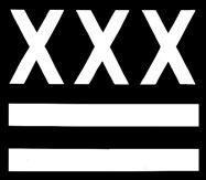
Origin Of The Louisville Hardcore Logo
The Louisville Hardcore "Logo" (fig.1) which started being used by many Louisville bands in 2003, dind't quite originate here in town. Some people might be suprised to hear that. Hell, some people may be suprised to hear that those are fluer-de-lis over the 2 bars, and not banannas. While many people in Louisville may have a great affinity for banannas, as a city, we don't love them that much. The reason for the fluer-de-lis comes from the fluer-de-lis being the city symbol of Louisville. Our city, as were many towns in the area, was named after King Louis The XVI of France. Over the years, the fleur-de-lis had become a symbol of power in France, and by adopting this symbol, Louisville attempted to pay homage to French royalty in more than just the city name (Louis XVI = the Louis in Louisville. duh.) Furthermore, the ciy of Louisville incorporated 3 fleur de lis into it's flag, hence the 3 fleur de lis on the hardcore logo.
However, this sign of royalty does not complete why the hardcore kids use the symbol in it's current configuration. After viewing figure 2 and figure 3, it becomes pretty apparent where the layout came from. The "3 stars, 2 bars" logo was placed on the flag of Washington D.C. after being fashioned to represent the British coat of arms of General Washington's ancestors. Years later, around 1980 to be somewhat more precise, the kids of Washington D.C. (most likely the Georgetown punks - The Teen Idles, Minor Threat, S.O.A, etc...) used the symbol in conjunction with something that they had just made up - Straight Edge. By placing the Edge symbol of "X" in place of the stars on their hometown's logo, they created a symbol for all of those straight edge and hardcore kids to claim as their own. This is specifically what the symbol was created for in regards to Louisville. Ryan Patterson of Black Cross took the DC hardcore symbol, which has somewhat fallen by the way side and few bands use anymore, and re-molded it into a symbol of pride for the Louisville hardcore kids.
Since the creation of the Louisville version, there have been a few further mutated versions, such as the Redhanded logo with 2 bars, 2 hands, and a fleur de lis in the middle, or the Pocket Bomb logo with 2 fleur de lis and a bomb in the middle.
Bands that use this imagery:

